总结 0.5px border 的实现方法。
乞丐版本
1
2
3
| .hr {
border: 0.5px solid red;
}
|
缺点非常多,几乎不能兼容,常见的浏览器都是真实显示 1px。
逻辑可行、实际很惨的线性渐变 linear-gradient
1
2
3
4
| .hr.gradient {
height: 1px;
background: linear-gradient(0deg, #fff, #000);
}
|
缺点是明显发虚,不是真实的 0.5px 实线
box-shadow方式
1
2
3
| .hr.boxshadow {
box-shadow: 00.5px0#000;
}
|
缺点是各流览器都是虚的,也不是完美方案
使用SVG
完美的解决方案,还可以适配不同形状的图形。
原理是利用 SVG 的描边属性为 1 物理像素(物理像素最低也必须得有 1,不然什么也看不见了),是高清屏的 0.5px。
缺点是有些复杂,简单的直线不必上 SVG。
若用 SVG 时,部分场景也需要绝对定位和设置pointer-events : none
1
| <object data="./halfLine.svg" type="image/svg+xml" />
|
SVG 文件(halfLine.svg)
1
2
3
| <svg xmlns="http://www.w3.org/2000/svg" width="100%" height="1px">
<line x1="0" y1="0" x2="100%" y2="0" stroke="#000"></line>
</svg>
|
transform scale(0.5)
用伪元素画出 200%宽高的边,然后transform scale(0.5)缩小,然后用pointer-events:none去除点击/聚焦事件。
完美的解决方案,简单易用。
缺点是只能画直线和border,缺点是有实际文档流中的体积,且配合按钮写宽度不好计算及控制。
使用伪元素,将伪元素绝对定位且设置无事件,可以完美解决体积及不好控制的问题。代码如下:
1
2
3
4
5
6
7
8
9
10
11
12
13
14
15
16
17
18
19
20
21
22
23
24
25
26
27
28
29
30
31
32
33
34
| <!DOCTYPE html>
<html lang="en">
<body>
<style>
.half-1px-line,
.half-1px-border {
position: relative;
}
.half-1px-line::after,
.half-1px-border::after {
content: '';
position: absolute;
width: 200%;
height: 200%;
top: 0;
left: 0;
transform-origin: 0 0;
border-width: 1px;
border-style: solid;
transform: scale(0.5, 0.5);
border-radius: 1px;
box-sizing: border-box;
pointer-events: none;
}
.half-1px-line::after {
border-width: 0;
border-bottom-width: 1px;
}
</style>
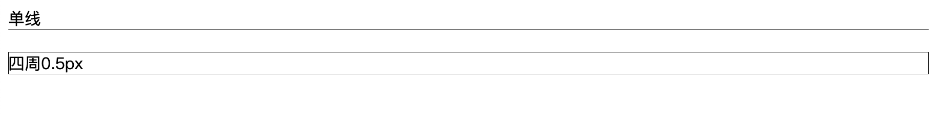
<div class="half-1px-line">单线0.5px</div>
<br />
<div class="half-1px-border">四周0.5px</div>
</body>
</html>
|
参考文档
怎么画一条 0.5px 的边(更新) - 掘金 juejin.im